Finding your way around#
The layout is identical on every screen. Once you understand it, you can navigate a module you have never opened before.
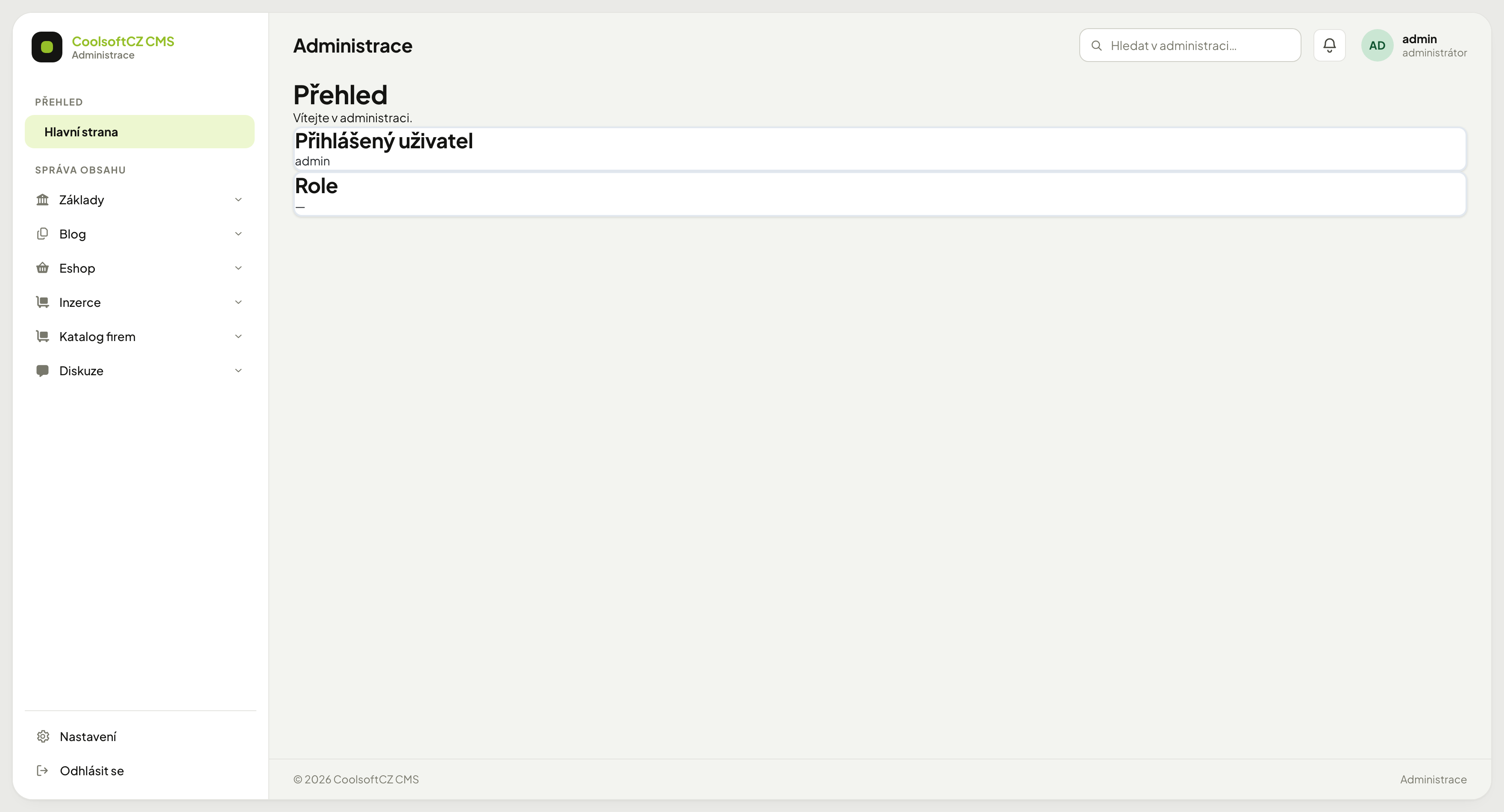
The home page — what needs attention#
The first screen after signing in. At the top is the What needs attention band — cards showing what has to be done.
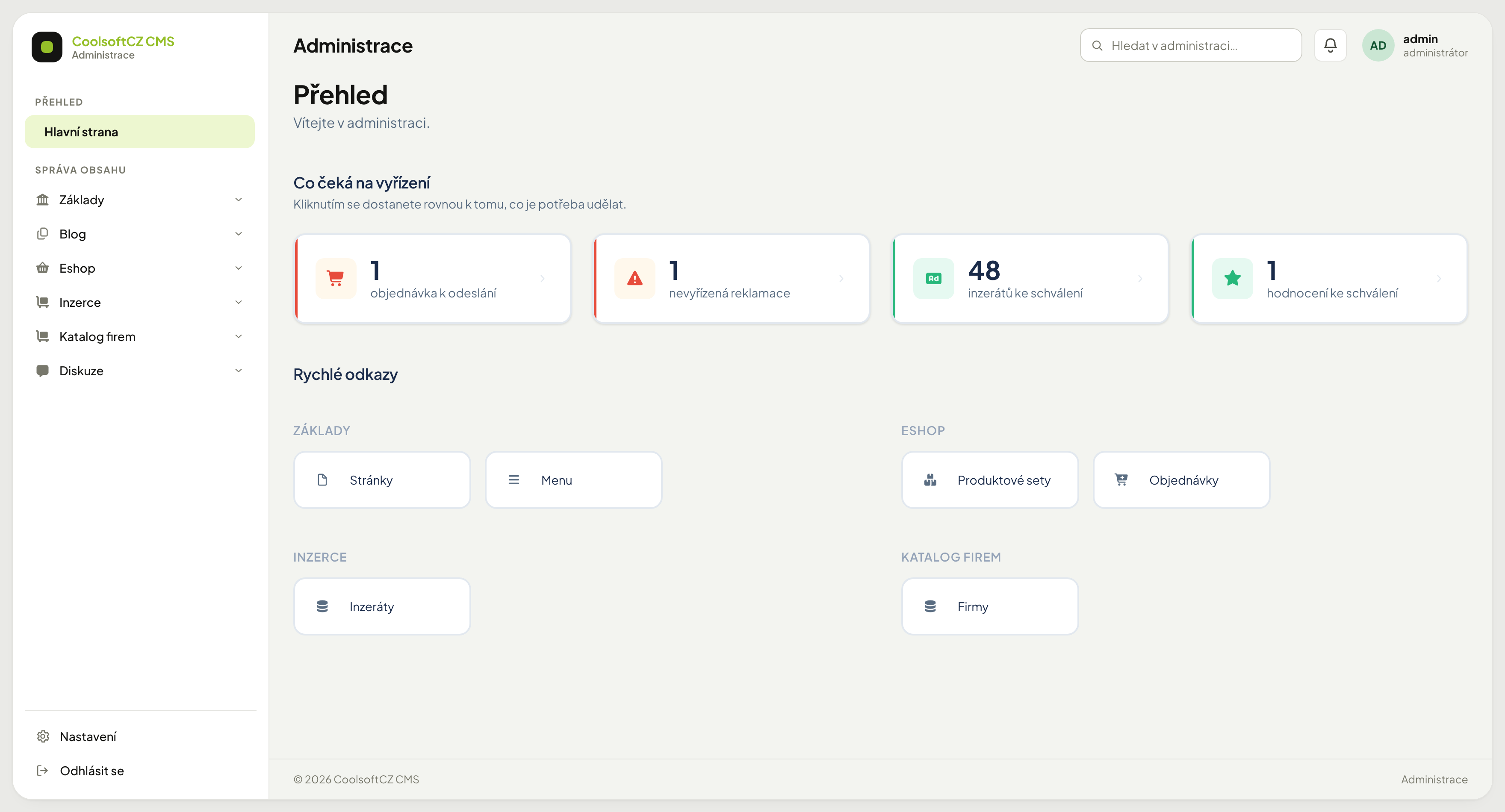
Each card carries a count and links straight to the relevant listing. As many appear as there are things to deal with:
| Card | Meaning |
|---|---|
| Orders to dispatch | received and not yet shipped |
| Open complaints | a complaint that is not closed yet |
| Overdue invoices | unpaid documents past their due date |
| Unfinished payments | the customer went to the gateway and did not come back |
| Adverts to approve | waiting on your decision |
| Companies to approve | waiting on your decision |
| Comments to approve | waiting on your decision |
| Reported comments | flagged by a visitor |
| Ratings to approve | waiting on your decision |
| Unread replies | responses to adverts |
| Unsent emails | messages the queue gave up on |
Adverts, companies, comments, and ratings each have their own card
"To approve" is not one combined card — adverts, companies, comments to approve, reported comments, and ratings to approve are five separate cards, each with its own link. Only the ones with something to handle appear.
Cards with a zero are not shown
If you cannot see the orders card, it means none are waiting — not that something broke. When nothing is waiting, one sentence appears instead of an empty grid.
You see only what you have access to
Somebody without e-shop rights does not see the orders card. Colleagues may therefore see a different home page — see Roles and privileges.
The card colour says how urgent it is
A red stripe means somebody is waiting for money or goods. Green means it is waiting on your decision. Grey is an operational notice that can wait.
Quick links#
Below the "what needs attention" band is Quick links — tiles for the screens you use most. They are grouped into sections following the menu.
You choose what appears under Nastavení → Dlaždice dashboardu (the Nastavení link at the foot of the left column): switch Na dashboardu on for an item. The toggle saves right in the listing; there is nothing to click through to.
| Column | Purpose |
|---|---|
| Menu item | what should appear |
| On the dashboard | on / off |
| Order | position within the section |
An order of 0 means “as in the menu”
So you need not number anything. Enter a number only for a tile you want first in its section.
The section is not something you set
A tile files itself under the part of the menu it comes from. Rename the menu item and the tile's label changes with it.
Only items that lead somewhere are offered
Groups and headings in the menu (Eshop, say) have no target, so you will not find them in the listing — the tile would lead nowhere.
Less is more
Tiles are meant to shorten the path to what you do daily. Switch half the menu on and you have made a second copy of it, which speeds up nothing.
Parts of the screen#
Left column — the menu. The main navigation. Items are grouped into sections (Přehled, Správa obsahu) and most have sub-items that expand on click. At the very bottom are Nastavení (settings) and Odhlásit se (sign out). The Nastavení link is the only way into the whole settings section — do not look for it in the menu; see Settings.
Top bar. On the left, the name of the current screen. On the right:
| Element | What it does |
|---|---|
| Hledat v administraci… | searches records across modules |
| Bell | system notifications (new orders, delivery failures…) |
| Your account | name and role; opens the account menu |
Main area. The actual content — either a table of records or a form. Each has its own chapter: Working with tables and Working with forms.
How the menu is organised#
The menu does not map one-to-one onto modules; it is arranged around how the site is actually worked with:
| Section | What it contains |
|---|---|
| Základy | Pages, Menu, Users, Payments and currencies, Invoicing, E-mail, Polls, Ads, Ratings, Comments, Localisation, PDF templates, Images, Files |
| Sklad | stock items, stock documents, suppliers |
| Blog | articles, news, events, galleries |
| Eshop | products, orders, shipping, complaints |
| Inzerce | adverts, categories, tariffs |
| Katalog | company profiles |
Manual chapter names match the menu
Chapters are named after menu items. Where the manual says "Adresář", look for Adresář in the menu — not for "customers".
System messages#
After every action a coloured bar appears at the top:
| Colour | Meaning |
|---|---|
| green | the action succeeded, the change is saved |
| yellow | the action succeeded, but something deserves attention |
| red | the action failed, nothing was saved |
A red message means nothing was saved
It is not a warning for next time — it tells you your change did not go through. Read the message, fix what it points at, and save again.
Switching the content language#
If the site has several languages, multilingual fields carry language tabs above them. Switching a tab does not change the language of the administration — it only changes which language version of the content you are editing.
An unfilled language version shows up on the site as a blank, not as an automatic translation. See Languages and localisation.
Changes take effect immediately#
The administration has no draft state where changes wait. Once you save a record, it is saved and live on the site.
To avoid publishing right away, hide the record or schedule its publication — depending on what the given area offers.